Basic Colour Theory For Design Explained

What does the colour red mean to you? For me, it’s most definitely a colour that resembles power and desire. Though for others, this same colour signifies danger. Still more would say that red is the colour of love. And even more still would say it connotes blood, death and/or romanticism. In truth, red signifies all of these things – though of course they are determined by subconscious cultural forces over which we have little or no control. Indeed, the colour red has strong associations with communism in Russia and other parts of the world – though perhaps less so in the UK. And so,...
Read More

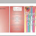
How To Create a Professional Brochure With InDesign (Part 2) – A Walkthrough Guide

the finished product
In Part 1 we looked at the fundamentals of brochure design. We considered the general design principles of Layout, fonts and headings, text and typesetting, and colour. Now in Part 2, I want to take you on a walkthrough for creating a brochure using InDesign from scratch. Let’s do it! Open Up Your Document to create a brochure with InDesign When opening InDesign, you will be greeted with this box asking which kind of document you want to create. Click “Document”. A second box will appear – this is where you set up the document type, size and specifications. As mentioned above, it’s ...
Read More

How To Create a Professional Brochure Using InDesign (Part 1) – Design Principles

With all the viral delights of today’s digital world, it can be very easy – and erroneous – to forget the power of good old-fashioned brochure advertising, for which there is still a much honoured place in the marketer’s arsenal. Easy to read, and, if designed to a good standard, the printed brochure can in fact be a true catalyst for brand awareness. The real world has yet to be completely usurped by the ever-encroaching techy tendrils of the digital, and in truth it never will. There will always be a need for printed, physical media, no matter how overbearing the digital counter...
Read More